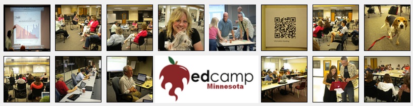
 One session at Edcamp Minnesota this year, led by John Wensman from St. Paul Academy, was a discussion session about “Visual Rhetoric within Digital Literacy” that brought up some themes and concepts I have been struggling with myself. The conversation was basically wrapped around the concept that with the emergence of digital technologies our world has become more visual and to some degree the rigor of academic classes is in danger. Some people in the discussion feared that the need to use multimedia and digital tools to make classes more “engaging” was eroding the quality of the curriculum. It is interesting that Just a few days later at the ISTE Conference in San Diego David Warlick presented a breakout session with a similar theme, “A Broader Perspective on Data: Infographics and Visualization.” It seems like there is an interesting development occurring around the intersection of data, digital integration, and visual rhetoric and an emergence of something new. When we are told our decisions in schools must be data-informed or data-driven what does it mean that trough aesthetics we can make data say almost anything?
Explore some of the links shared at these two sessions, there is some great content there, and let me know how any of this might be useful in your classroom or practice.
Resources:
- Periodic Table of Visualization Methods
- Purdue’s OWL
- Pomona
- Various Visualization Tools
- Digital Backpack: Visualization Tools

I did not attend the Visual Rhetoric & Data session at edcamp led by John Wensom and had not heard much on this topic before beginning to explore some of the resources provided.
After looking through the “OWL Purdue Writing Lab” I became interested in the section regarding which fonts to use when presenting information. I had never given much thought to why I chose a certain font, the size of the font, etc. After looking through this section I got some helpful tips about what types of fonts are typically more visually appealing in different situations, what types of fonts mix well and which ones do not, and the differences in the readability between fonts. I never really thought too much about the effects of using various fonts and will use this information to help make font decisions when composing e-mails, presentations and classroom visuals.
I also really liked the “Digital Backpack Visualizing Tools” link. I would use “Wordle”, which generates a word cloud from the text you provide. I would use this when creating a presentation to share information from a conference, with co-workers, to give an overview of the information that would be provided. I will use “Spell with Flicker”, which converts text you enter to an image, with children as a motivator when working on articulation or language goals. “Create a Graph” also seemed like a great tool that I can utilize with children to easily make a bar chart, line chart, or pie chart to graph results of a classroom vote, classroom experiment, etc.
For the record, I don’t believe incorporating visual approaches needs to trade rigor for engagement, although it often does. Teaching and assessing visual rhetoric parallel to a writing thread offers an essential opportunity to expand student skills in an increasingly visual world. I hope that we can increase the rigor of our approach to visual work which is often used as a ‘creative’ side project to the written work we assign.
I did attend The session and I loved John’s approach. I see his work as an attempt to elevate visuals from “make it look pretty/presentable” to visuals as a part of the message itself. Form IS content.